About MeResumeDKProjectsPublications
David Kuo Portfolio Website
↓ Scroll to continue
0:000:00
← Projects

2026

David Kuo Portfolio Website

Designer / Frontend Engineer / CMS Architect

A portfolio rebuilt as both a presentation system and a publishing tool. The public experience remains a fast static website, while a protected visual CMS lets me reconstruct legacy case studies, manage R2 media, preview complex layouts, and publish changes through GitHub and Cloudflare.

Tools & Software

Next.jsTypeScriptCloudflare PagesCloudflare R2GitHub API

Categories

Interactive

The Challenge

From a fragile mobile build to a production portfolio

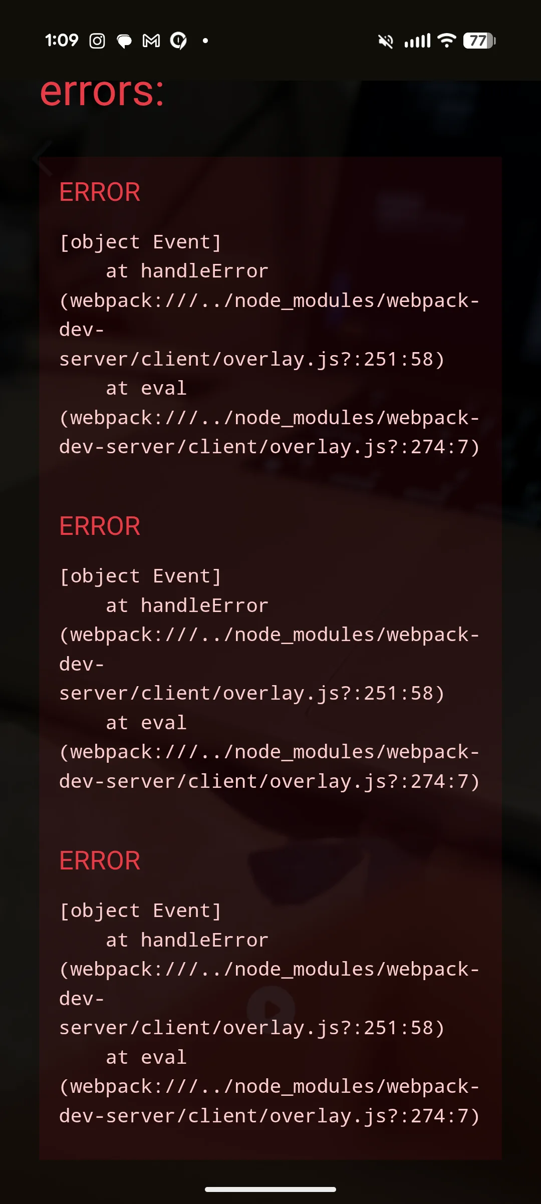
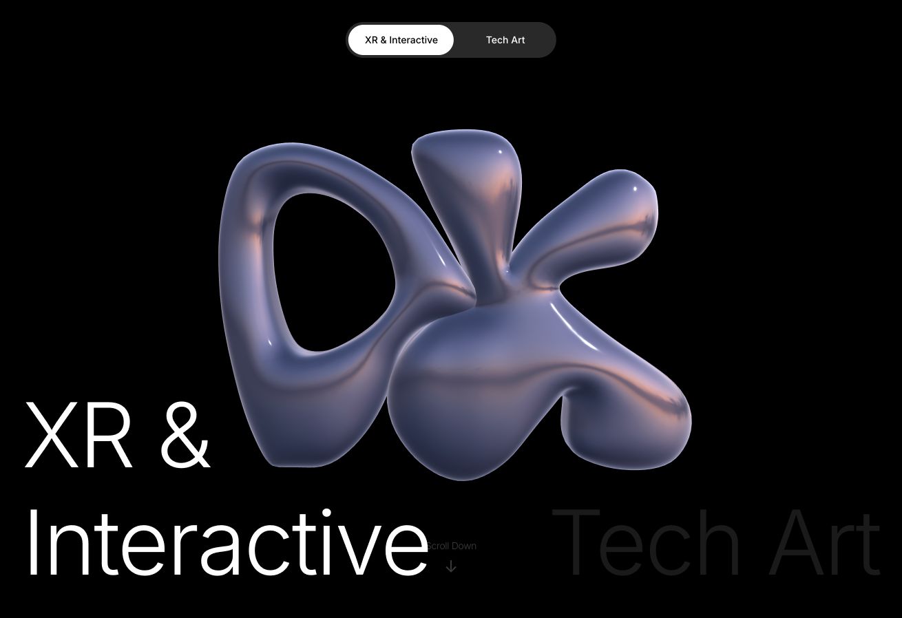
An early mobile build could fail before the portfolio appeared, leaving the visitor inside a full-screen webpack error overlay. Even when a page loaded, years of work were split between WordPress, local files, oversized videos, image sliders, and several generations of layouts. The rebuild treated reliability, presentation, and authoring as one problem. The current production site is statically generated, the 3D identity adapts to the device, media is delivered from R2 at an appropriate size, and every case study can be edited through a protected visual CMS.

From a fragile mobile build to a production portfolio — before
From a fragile mobile build to a production portfolio — after
BeforeAfter

Content Migration

The importer recovered files; visual review recovered intent

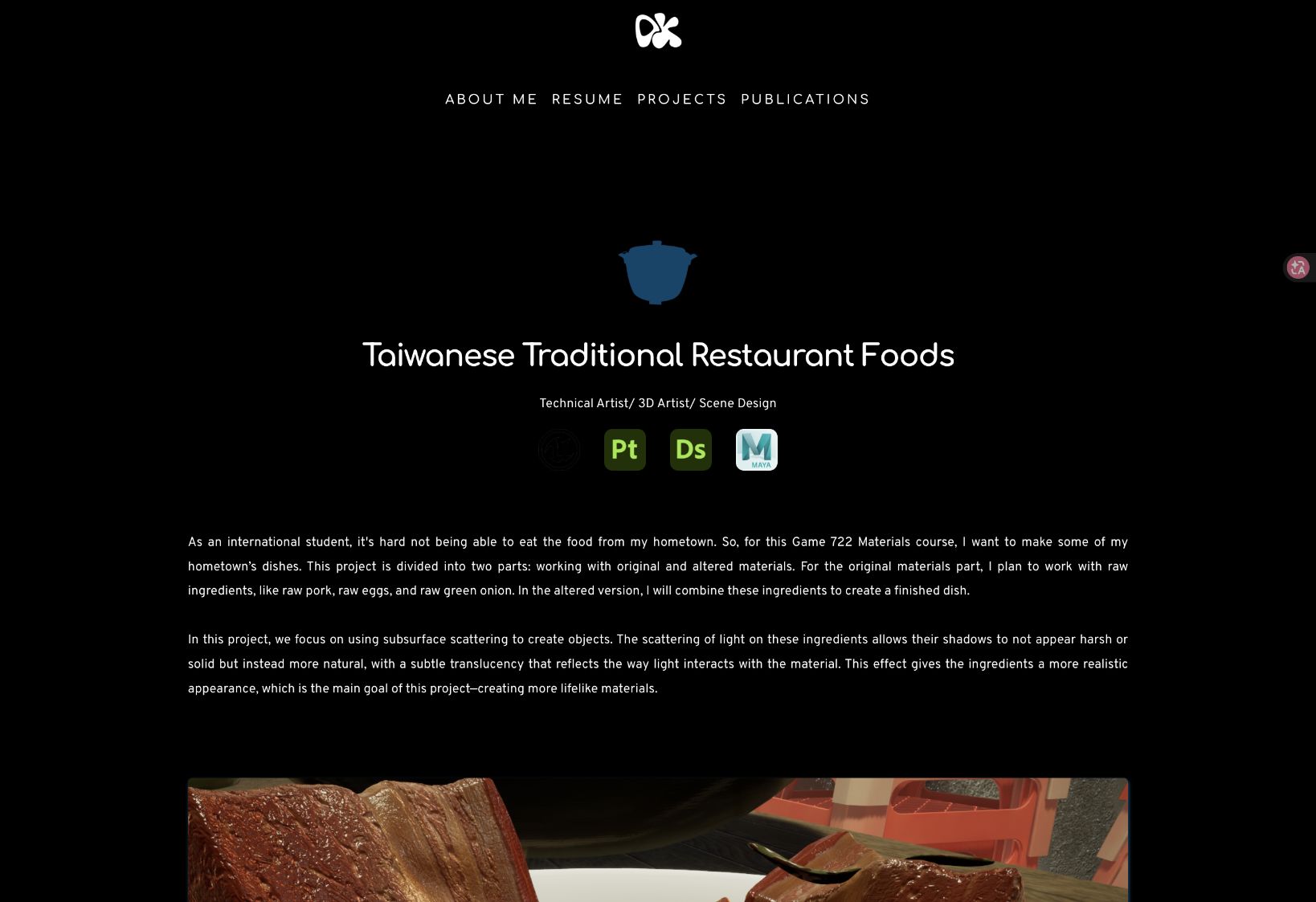
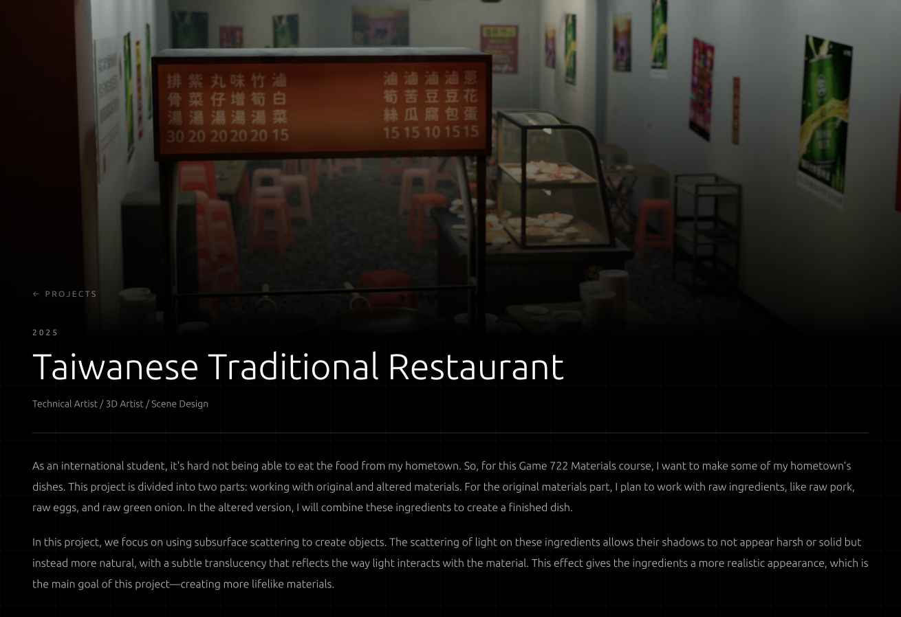
Legacy WordPress pages contained relationships that a basic importer could not understand. Some images belonged to draggable before-and-after sliders; others were four-frame process sequences, videos, or small technical diagrams that should never be stretched to full width. A first-pass import could recover assets, but it could not reliably preserve their intent. I rebuilt the Taiwanese Traditional Restaurant case study section by section, comparing the downloaded HTML with the published page. The process revealed where automated extraction had changed text, misplaced media, lost slider pairings, or cropped images. Those findings became reusable fields in the new project schema instead of one-off fixes.

The importer recovered files; visual review recovered intent — before
The importer recovered files; visual review recovered intent — after
BeforeAfter

Concrete differences between the legacy and current pages

Legacy: WordPress plugin markup defined sliders and layouts indirectly; extracted images could lose their pairing; thumbnails such as 263 × 148 were sometimes selected instead of the 912 × 513 source; fill-style containers cropped wireframes and material graphs. Current: each media relationship is explicit JSON. Before/After is a dedicated draggable comparison mode. Four-frame sequences use a 1920 × 1080 high-quality Animated WebP rather than a 256-color GIF. Still images keep their original aspect ratio with object-fit: contain. Small diagrams can define a maximum width, and replacing an image preserves its focal position, scale, ratio, caption, and width settings.

Concrete differences between the legacy and current pages — before
Concrete differences between the legacy and current pages — after
BeforeAfter

Media Pipeline

One source file, responsive delivery

CMS data stores the original `https://cdn.davidkuo.tech/...` R2 URL. At render time, the custom Next.js image loader requests only the width needed by the device. It generates Cloudflare transformations using width, quality=75, format=auto, fit=scale-down, metadata=none, and onerror=redirect. Quality is clamped between 45 and 85, and scale-down prevents a small source from being enlarged. This keeps the CMS independent from a particular output size while avoiding the old behavior of sending the same large image to every screen. Animated WebP and GIF assets bypass transformation so animation frames are not flattened or recompressed.

David Kuo Portfolio Website — One source file, responsive delivery 1

The rebuilt case study using responsive R2 media without fill-cropping

Adaptive showreel sizes

Each showreel has 480p, 720p, and 1080p files in R2. Save-Data, slow-2g, 2g, 3g, or a viewport up to 768 px receives 480p. A fast connection between 769 and 1024 px receives 720p. A fast desktop wider than 1024 px receives 1080p. The player loads metadata first instead of downloading every video immediately. Process videos inside case studies start only after at least 35% enters the viewport, pause when scrolled away, loop silently, play inline on mobile, and omit controls when the video is intended as an animated demonstration.

David Kuo Portfolio Website — Adaptive showreel sizes 1

Live production showreel — the selected source changes between 480p, 720p, and 1080p

Three.js & 3D Logo Editor

The same identity, a smaller rendering budget

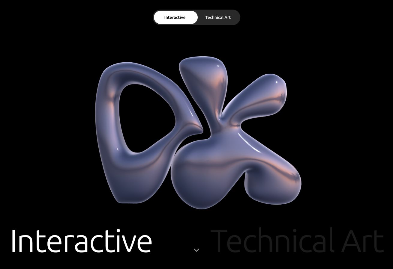
The interactive DK logo is a 452 KB GLB with a custom vertex displacement shader and physical glass material. On mobile (under 768 px), WebGL antialiasing is disabled and renderer pixel ratio is capped at 1; desktop is capped at 1.5 instead of blindly using the device's full pixel density. The logo scale is multiplied by 0.3 below 640 px and 0.6 below 1024 px so it remains framed correctly without rendering unnecessary off-screen pixels. The 512 px HDR environment map begins loading in parallel with the GLB. Basic hemisphere and directional lights render the logo immediately, so the first frame does not wait for HDRI. Renderer, composer, geometry, materials, textures, event listeners, and animation frames are explicitly disposed during cleanup to prevent memory from accumulating across navigation.

David Kuo Portfolio Website — The same identity, a smaller rendering budget 1

The production Three.js logo rendered with its glass material and HDR lighting

David Kuo Portfolio Website — The same identity, a smaller rendering budget 2

The same GLB and shader running under the reduced mobile rendering budget

A real editor for the 3D identity

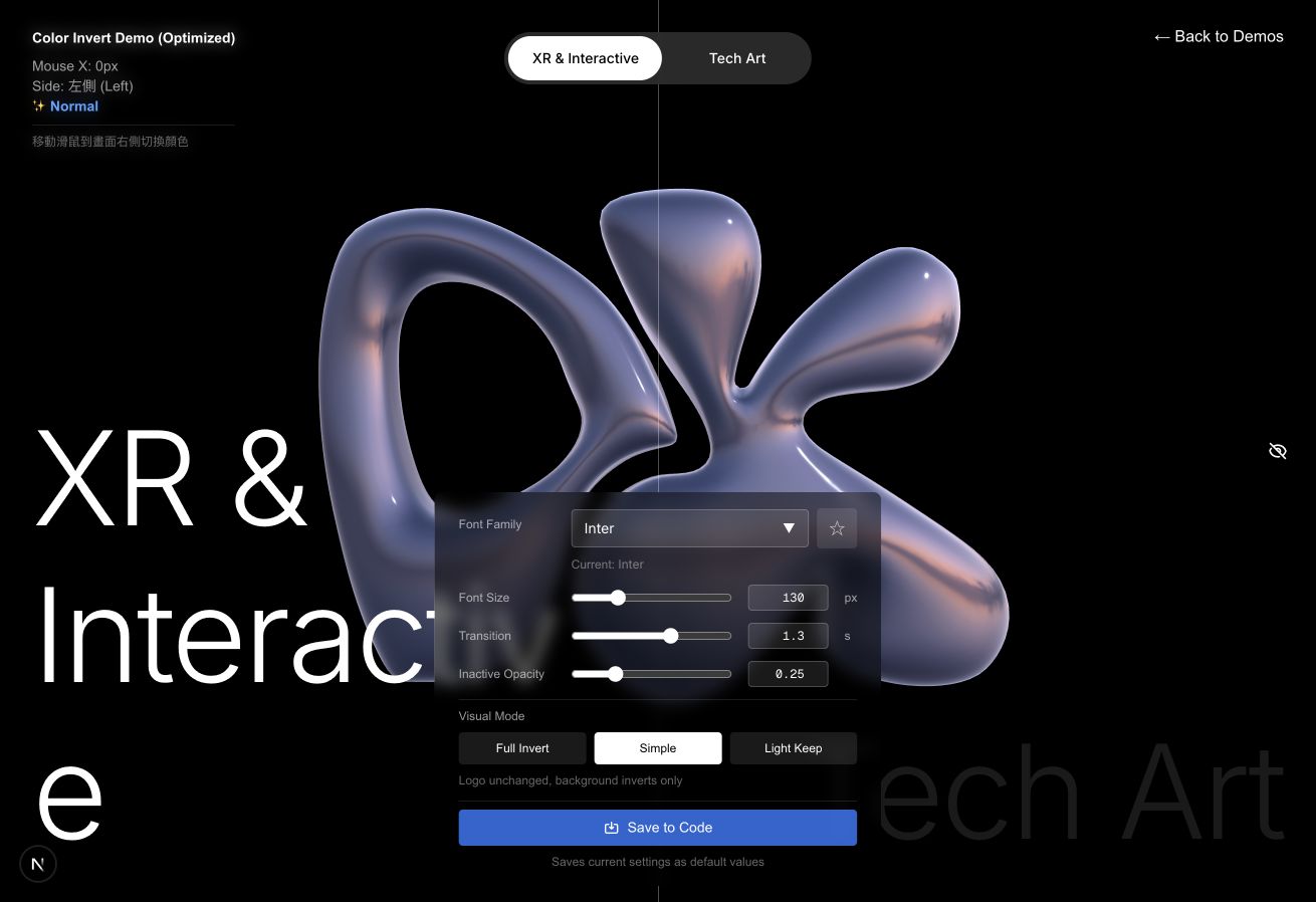
I built a dedicated editor around the Three.js experience instead of repeatedly changing hard-coded values. It exposes the typography, font size, transition timing, inactive opacity, inversion mode, and light-preservation thresholds while the GLB, shader, lighting, and post-processing remain live behind the panel. That made visual tuning reproducible: a setting could be evaluated against the moving 3D logo, saved, and then transferred to the production experience without shipping the authoring controls to visitors.

David Kuo Portfolio Website — A real editor for the 3D identity 1

Actual 3D Logo Editor — live Three.js canvas with the production tuning controls

Measured mobile improvement

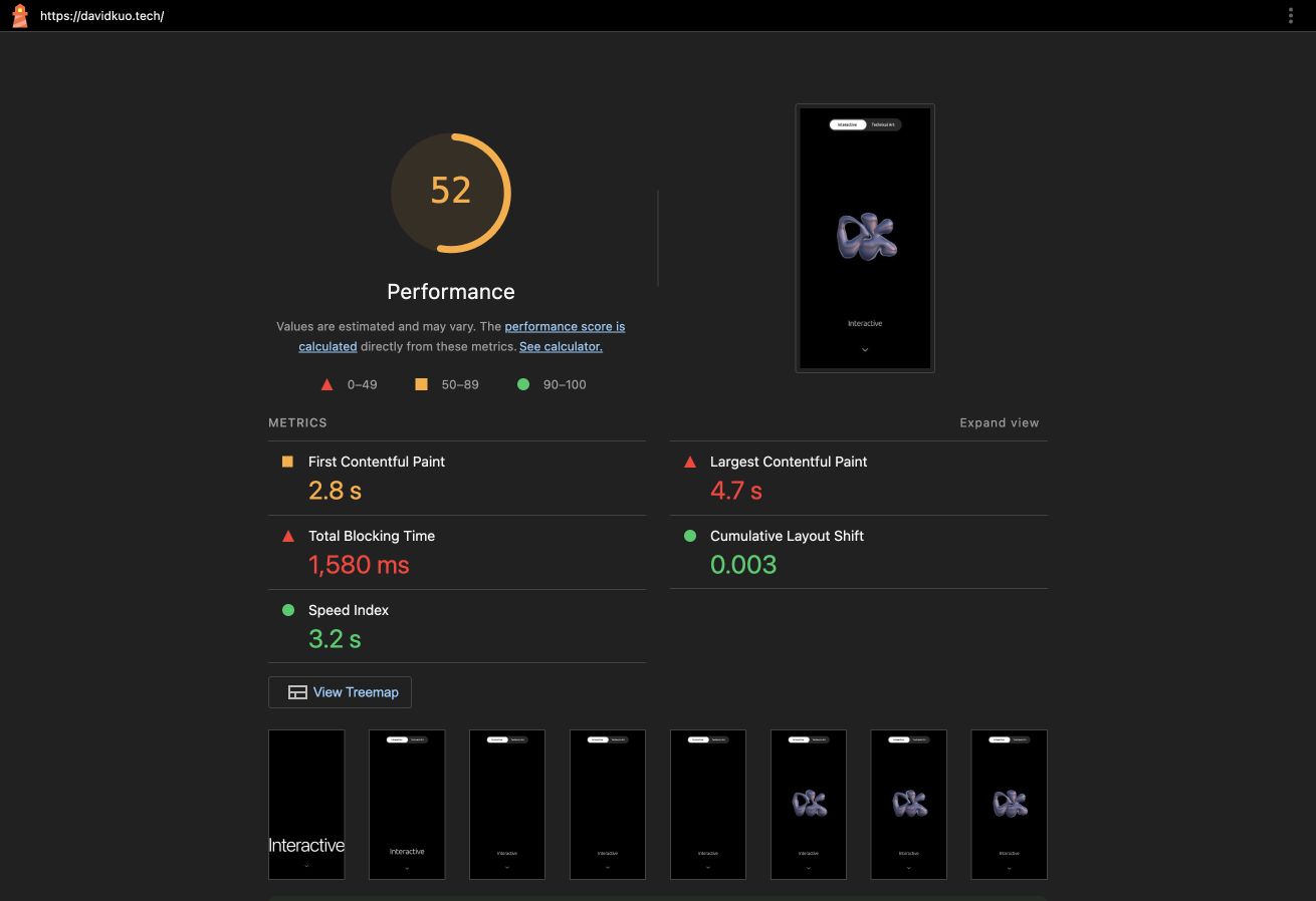
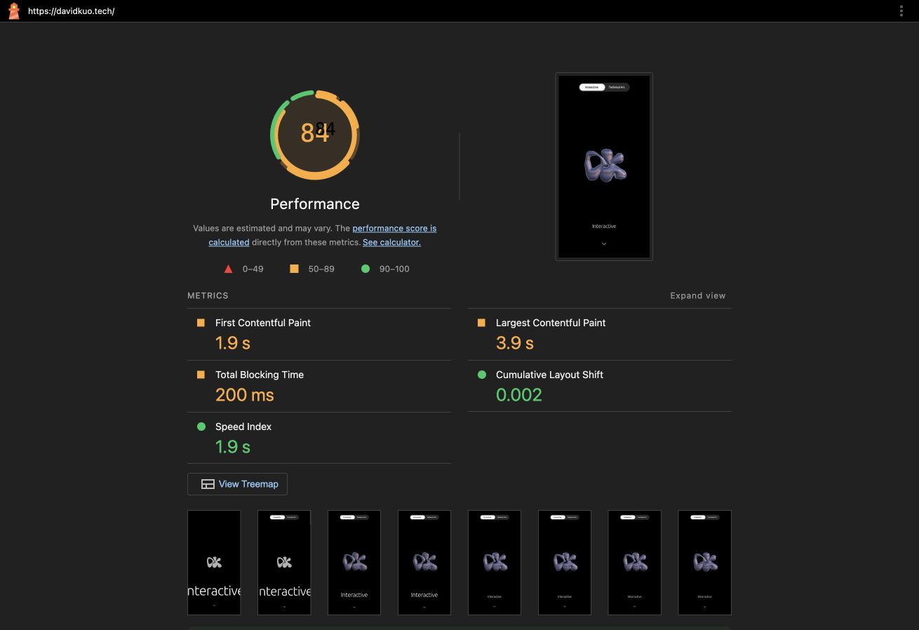
The stored mobile Lighthouse baselines show Performance improving from 52 to 84. First Contentful Paint improved from 2.8 s to 1.9 s, Largest Contentful Paint from 4.7 s to 3.9 s, and Total Blocking Time from 1,580 ms to 200 ms. Cumulative Layout Shift remained effectively stable at 0.003 → 0.002. The largest gain is not a visual trick: reducing main-thread blocking by 1.38 seconds means the page becomes responsive much earlier on a phone while retaining the interactive 3D presentation.

Measured mobile improvement — before
Measured mobile improvement — after
BeforeAfter

Static-first CMS

Static for visitors, editable for the author

The public website is still generated as static HTML. Visitors do not wait for a database or application server to assemble a project page. The editing workflow is separated from that public delivery layer: protected Cloudflare Pages Functions receive CMS requests, validate the administrator session, and save structured project JSON through the GitHub API. A commit to main then triggers a fresh static deployment. This creates a clear publishing loop: edit visually, save to GitHub, build once, and serve the result globally as static files.

David Kuo Portfolio Website — Static for visitors, editable for the author 1

Actual protected CMS — project metadata, live canvas, and Save workflow

A small system with explicit boundaries

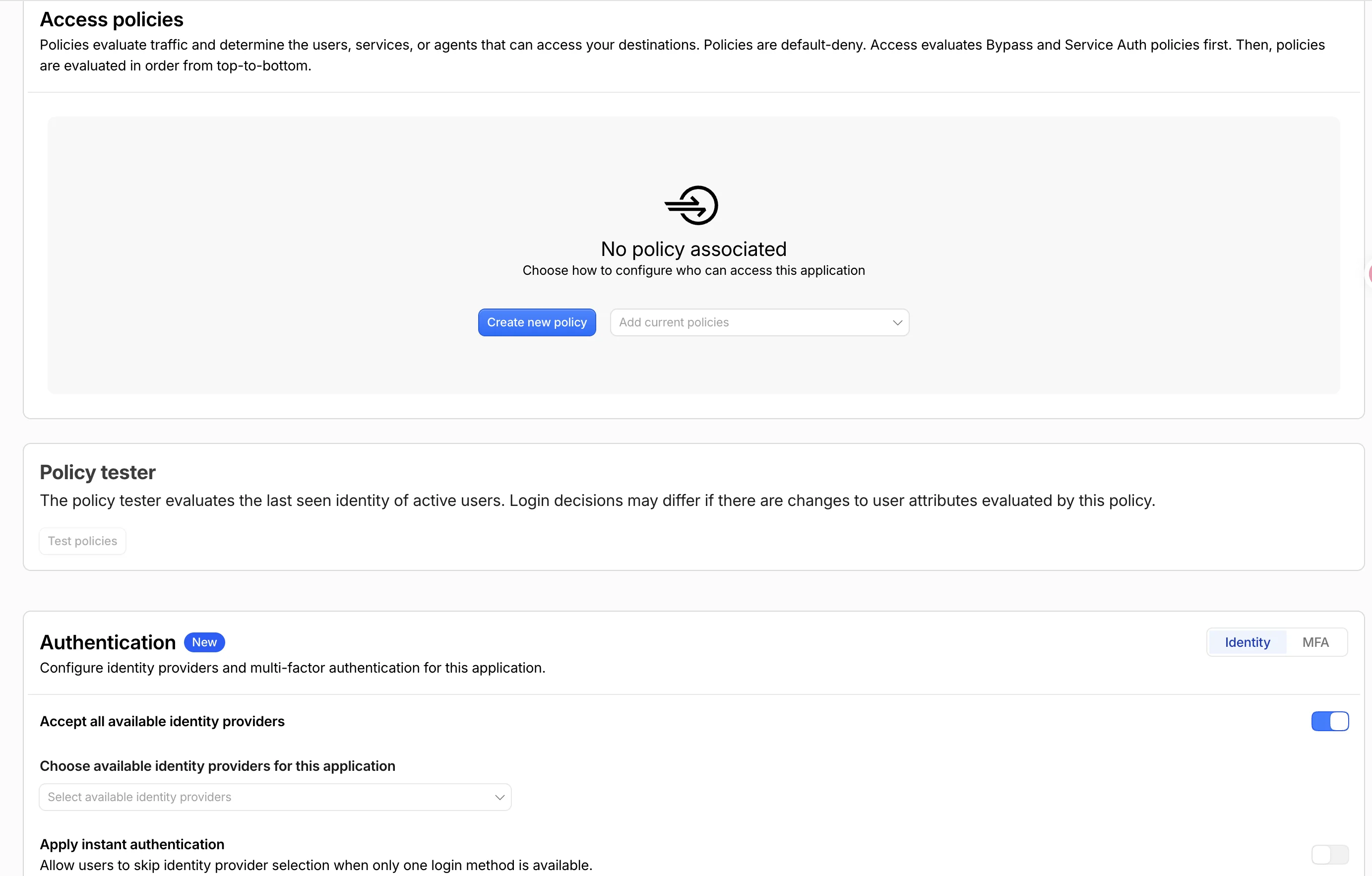
Cloudflare Access protects the Admin route. Its signed JWT is verified by the API before any content can be read or written. GitHub and administrator credentials remain encrypted secrets and never enter the browser bundle. R2 handles media, GitHub keeps versioned content, Pages Functions provide the narrow write layer, and the main site remains static.

David Kuo Portfolio Website — A small system with explicit boundaries 1

Cloudflare Access policy configuration used to protect the editor

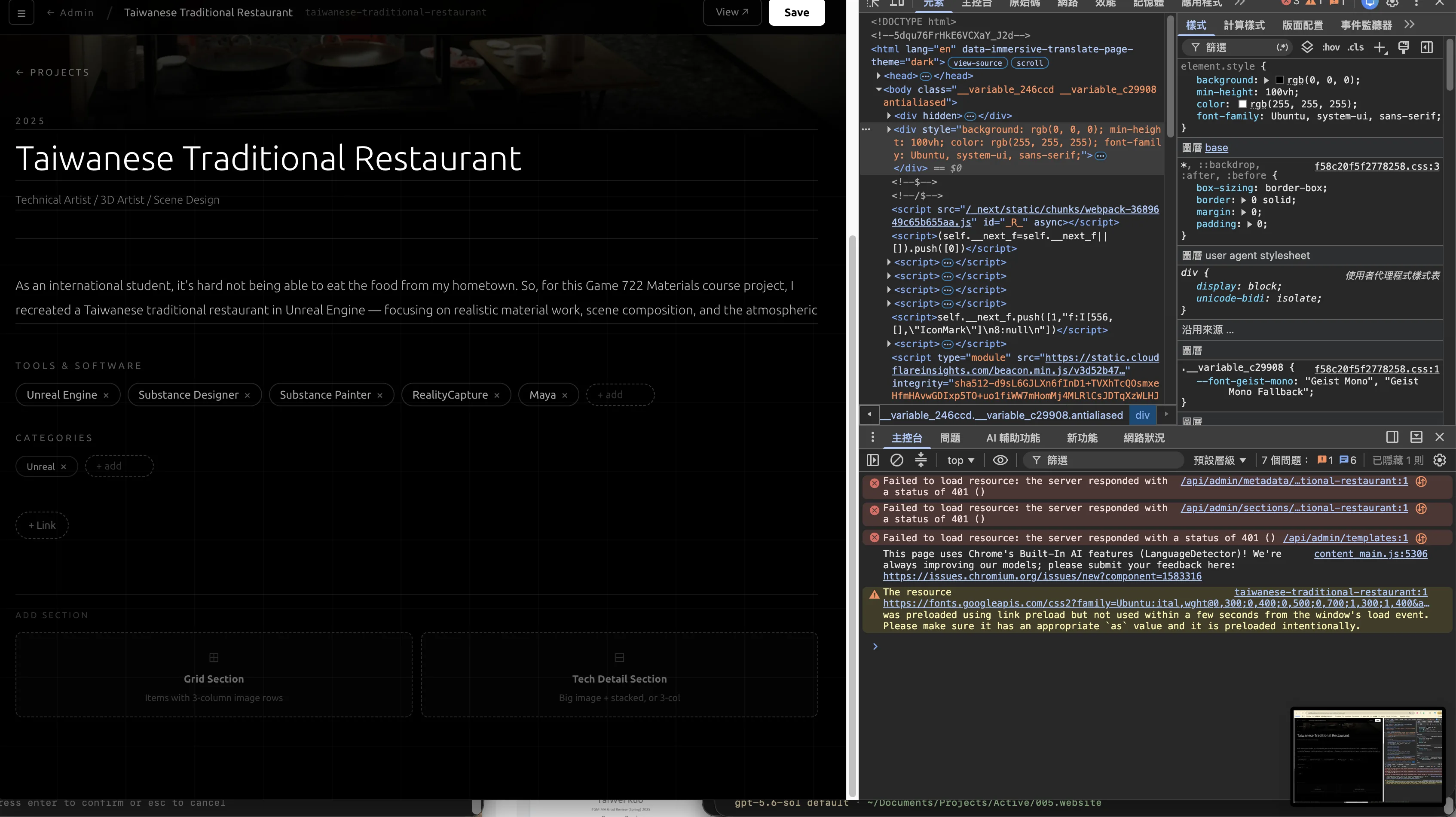
David Kuo Portfolio Website — A small system with explicit boundaries 2

Production authentication debugging before the API integration was corrected

Editing Experience

The editor should not change the design it is editing

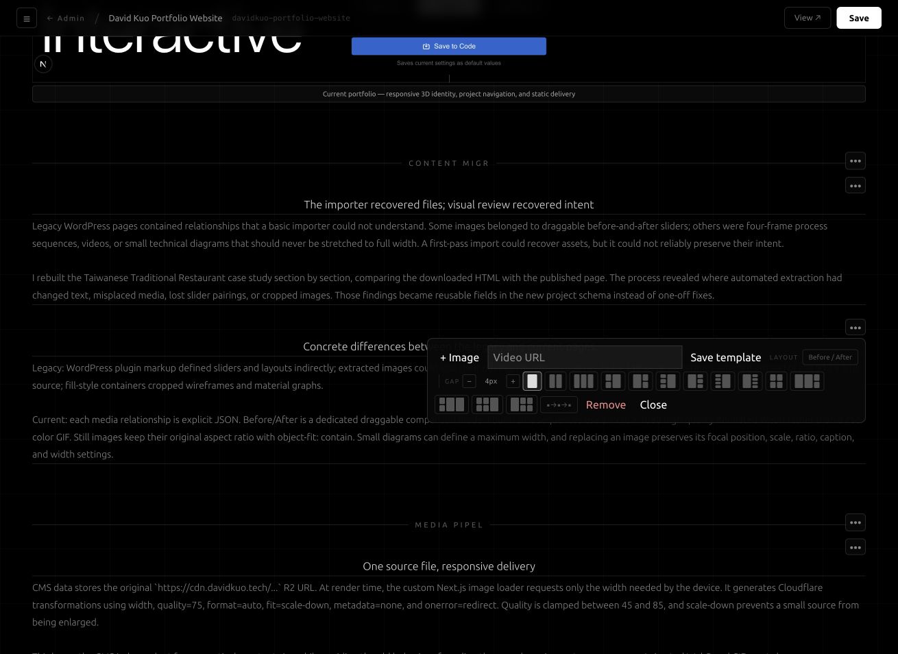
Early versions of the Admin interface placed layout buttons, AI tools, delete actions, and empty media placeholders inside the content flow. Those controls squeezed section headings and created large blank regions that did not exist on the public page. The editor was reorganized into two layers. Project content follows the same spacing, alignment, video, and comparison components as the published page. Editing actions float above it in contextual popovers. Empty fields occupy no layout space, descriptions remain left-aligned, videos play in place, and before-and-after media uses the same draggable divider seen by visitors.

David Kuo Portfolio Website — The editor should not change the design it is editing 1

Actual editing view — item actions float over the shared project renderer

Outcome

A portfolio that can keep evolving

The result is not a finished collection of fixed pages, but a reusable publishing system. It can restore older work with greater fidelity, support new storytelling patterns without rebuilding the site, and keep the public experience lightweight. The architecture also preserves a complete history of every content change through Git, making the portfolio easier to maintain as both the work and the website continue to evolve.

A portfolio that can keep evolving — before
A portfolio that can keep evolving — after
BeforeAfter